

Islanders Stadium Series revealed
Started by NYIslanders21, Nov 27 2013 05:13 AM
20 replies to this topic
#1

Posted 27 November 2013 - 05:13 AM
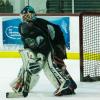
I will say that these are better than their black third jerseys and I like how they did something different with the stripes. I hate how the pants logo has to be so big to accommodate the stadium layout so people can see it. They gloves are ok but not sure if white on the fingers were the way to go

#2

Posted 27 November 2013 - 06:38 AM
Way better than buffalos get up! I actually like it alot!!!!
Liddy:-)

#4

Posted 27 November 2013 - 07:33 AM
Thin orange outline around the logo and it would look great. Way better than the thirds...
#5
modny123
-

- Member
-

-
- 100% Positive Feedback
- 34 0 0
- 3,197 posts
100% LEGIT MEMBER
- LocationHamilton Ontario
Posted 27 November 2013 - 07:47 AM
wait!!
what is this for?
forecheck backcheck paycheque
My eBay feedback
@emodny on twitter
@emodny on instagram
Golden Horshoe Dangles Crew
#6
Posted 27 November 2013 - 07:49 AM
It's for the stadium series
I like how they went more modern / future instead of the normal retro look
I like how they went more modern / future instead of the normal retro look
#7

Posted 27 November 2013 - 07:50 AM
Wow, that's a sick setup! 
Follow us:
Instagram: http://instagram.com/sports2k_com#
Facebook: https://www.facebook.com/pages/Pro-Stock-Hockey-Sports2Kcom/151010068304116
Facebook: https://www.facebook.com/pages/Pro-Stock-Hockey-Sports2Kcom/151010068304116
#8
olioli
-

- Moderators
-

-
- 100% Positive Feedback
- 101 0 0
- 3,091 posts
All Show and No Go
- LocationBearded Clam County

#10

Posted 27 November 2013 - 09:18 AM
^ Agreed. I think it looks great other than the plain NY logo.
Looking for new CCM HPTK pants - Black - Size XL
#12

Posted 27 November 2013 - 10:07 AM
I like how they are keeping the same theme for all of the teams in the series. Can't wait to see what the pens jerseys will look like.
-Looking for Warrior Goligoski gloves
-Looking for Florida Everblades gear
-Looking for Florida Everblades gear
#13
Posted 27 November 2013 - 10:10 AM
I like how they are keeping the same theme for all of the teams in the series. Can't wait to see what the pens jerseys will look like.
+10000000!
#14

Posted 27 November 2013 - 11:08 AM
The only draw back, IMO, is that chrome logo.
I love the chrome.
#15

Posted 27 November 2013 - 11:22 AM
I like the jersey and socks. Not a fan of the gloves at all, white fingers ruin them and the pants just don't do it for me, not terrible though.
#16

Posted 27 November 2013 - 11:47 AM
Looking forward to seeing the Warrior and Bauer mitts!
My Feedback - http://www.sports2k....1044-novahands/


#19

Posted 27 November 2013 - 02:49 PM
Maybe I'm the only one, but everything about these uniforms is awful. Extremely ugly.
#20

Posted 27 November 2013 - 02:58 PM
Maybe I'm the only one, but everything about these uniforms is awful. Extremely ugly.
The logo and white fingers ruin it for me.


