
Ooops sorry. The icewarehouse website has gloves called the Mako M3 that look just like those. Kovey, I agree man...the Makos are disgusting.
2023-2024 Pro Stock Sightings
Started by larrivee, Jul 25 2012 10:29 AM
16553 replies to this topic
#4182


Posted 14 October 2013 - 01:16 AM


i hope he has like 3 pairs of pro returns just waiting for the eq sale. Anyone know if hes wearing a 14 or 15 wide? Hes a big boy so im guessing 15, but those look like a 14+1
IG: Fooj Media
#4183
greghughes
-
- Member
-

-
- 100% Positive Feedback
- 22 0 0
- 1,811 posts
Advanced Member
- LocationSouthern California
Posted 14 October 2013 - 02:43 AM
Personally i like the ccms better, teal outline is unreal

#4185

Posted 14 October 2013 - 07:10 AM
Little disappointed in Warrior's retro Ducks gloves there. They really should have incorporated some teal.
My Feedback - http://www.sports2k....1044-novahands/

#4187

Posted 14 October 2013 - 09:08 AM
Warriors retro Ducks gloves blow ass. CCMs look way better.
i completely agree. I want those CCM Shells.


#4190

Posted 14 October 2013 - 11:26 AM
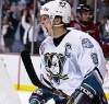
*Selanne Throwback Image*
There is nothing I do not like about this.
#4191
greghughes
-
- Member
-
-
- 100% Positive Feedback
- 22 0 0
- 1,811 posts
Advanced Member
- LocationSouthern California
Posted 14 October 2013 - 12:52 PM
There is nothing I do not like about this.
#4192
Posted 14 October 2013 - 01:22 PM
I hope the Ducks eventually do what the Oilers did, bring back their 'retros' as their primary uniforms. I've always loved these uni's. And I agree, at least in that pic, the color of the Warriors don't even match the uni's. CCM and Bauer did a much better job....kind of surprised to be honest.
#4193
Posted 14 October 2013 - 01:33 PM
I hope the Ducks eventually do what the Oilers did, bring back their 'retros' as their primary uniforms. I've always loved these uni's. And I agree, at least in that pic, the color of the Warriors don't even match the uni's. CCM and Bauer did a much better job....kind of surprised to be honest.
keep the name anaheim ducks but go back to the retro unis. I agree. the ones they have now are too boring


#4199
Posted 14 October 2013 - 05:27 PM
Watch the Ducks retro night gave me 90's flashbacks...
True story. Put on my old baggy pants and listened to some grunge rock
#4200
Posted 14 October 2013 - 05:42 PM
I think the old school font was one of the best parts of the night....seeing we have already seen these jerseys for the past few weeks
Great touch
Ps. would love to see a pair of CLs in the retro ducks colors


