Jump to content


Photo

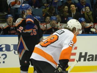
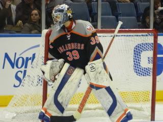
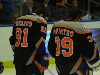
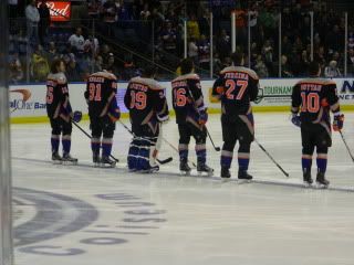
Photos of Islanders Third Jersey and Gear


  • Please log in to reply
9 replies to this topic

#1 NYIslanders21

NYIslanders21
  • LocationNew Jersey

Posted 24 November 2011 - 12:15 PM

Here are some photos I took last night I actually like the jerseys for some reason...I want a pair of pants and socks!

Posted Image Posted Image Posted Image Posted Image Posted Image

#2 DField56

DField56
  • LocationSan Jose

Posted 24 November 2011 - 01:00 PM

not good, not good at all lol

My Feedback

Always interested in Sharks gear


#3 NYIslanders21

NYIslanders21
  • LocationNew Jersey

Posted 24 November 2011 - 01:02 PM

I dont mind them...they tried something different...was there other options yes...could they be worse yes

#4 Yetso

Yetso
  • LocationLas Vegas, Nevada

Posted 24 November 2011 - 01:07 PM

I think the gray and the Dallas style front are whats throwing me off... Gray is not an Islander color, granted neither is black but the NHL decided that black was everyones color with the Black Ice jerseys. The pants (minus the gray) are pretty good looking, some goes for the socks. But over all... *puke*
Phrasing people! Phrasing!!!
#5 1stOverall

1stOverall

Posted 24 November 2011 - 02:15 PM

ugly just ugly

#6 Shark#81

Shark#81
  • LocationSproat Lake

Posted 24 November 2011 - 02:30 PM

Blue and orange are what is known as "complementary" colors in the art world. If those two "pure" colors are mixed they produce a grey, which is the third color of the jersey.
the sleeve striping/shapes overlays over the same design on the pants for an integrated & cohesive look.
The front logo is very simple vintage look from the art-deco period.
Blue is a strategic color to employ because arena lighting is heavy on the blue spectrum so it gives that aspect of the jersey vibrancy.

Overall they still look like shit.

Just kidding!! I like them. Contrast to the Flyers jersey in the xxx 4th pix these are much sweeter.
Latest hockey video:
http://youtu.be/Ncx5fned0ag?hd=1

#7 numan

numan
  • LocationDallas

Posted 25 November 2011 - 02:37 PM

I can't decide if I like the blue helmets with them or wish they had black helmets, that's my biggest issue with them so far. Other than that even though I do find them ugly off the ice, I do appreciate thr boldness of them and like them when in game action

#8 Dupes

Dupes

Posted 25 November 2011 - 05:20 PM

Not bad, not sure if I like it or not!

Posted Image
Follow us: Instagram: http://instagram.com/sports2k_com#
Facebook: https://www.facebook.com/pages/Pro-Stock-Hockey-Sports2Kcom/151010068304116

#9 Yetso

Yetso
  • LocationLas Vegas, Nevada

Posted 25 November 2011 - 06:54 PM

Got bored with MS Paint in between games... heres my take on what the Isles gloves should be like for the thirds, or at least something along these lines.

Posted Image
Phrasing people! Phrasing!!!

#10 NYIslanders21

NYIslanders21
  • LocationNew Jersey

Posted 25 November 2011 - 07:34 PM

good idea