Thoughts?

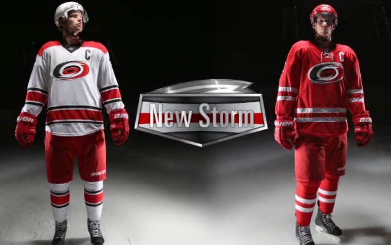
Home Jerseys are too close to Detroits, not to mention their gloves. I heard there will be no more 3rds (black)... hope not, those were the better looking ones IMO.

Proud teacher at ToeDrag U since 1995


Posted 04 June 2013 - 11:44 AM
Sigh. Canes had some unique stuff and they change it to THIS? Not happy.
Posted 04 June 2013 - 11:46 AM
Looks like team canada jerseys
They got rid of the hurricane flag on the bottom of the jersey too.
Posted 04 June 2013 - 11:50 AM
The 3rds are staying. I'm also unimpressed with these. The home ones look like what team Canada should wear. The jerseys are almost exact, Canada just needs to be wearing red pants, helmets, and gloves as well.
It actually just occurred to me that when the Canes moved to Carolina they should have coloured themselves a little bit after the Tarheels. They coulda used Carolina blue. It woulda been perfect. It's far too late now though.
Posted 04 June 2013 - 12:06 PM
Posted 04 June 2013 - 12:25 PM
I like it 
Posted 04 June 2013 - 12:36 PM
Lacks creativity, imagination, originality, uniqueness.
#threadcloser
Posted 04 June 2013 - 12:37 PM
Wheel.Snipe.Celly
Posted 04 June 2013 - 01:00 PM
Hockey is Life. The rest is just details.
"Trade Steve Yzerman? That's like asking me if I want to trade my son Jason for the kid next door."
—Jacques Demers
Posted 04 June 2013 - 01:04 PM
NHL teams could care less that you want a pair of brand new Warrior Luxe/Franchise custom thumb loop super custom digi toilet paper soft palm with double added reinforced custom Warrior logo backhand padding gloves or a 17 flex double kreps curve upside down toe hook stick from your fav player/team. -Bakes
#3k 
Posted 04 June 2013 - 01:10 PM
at least add more black to the jerseys or keep the black in the pants.  from me
Their third jersey is still killer though
Posted 04 June 2013 - 01:20 PM
The whole thing just seems inconsistent to me. Not liking it at all.
Posted 04 June 2013 - 01:23 PM
Gangsta Rap Made Me Do it

Posted 04 June 2013 - 02:27 PM
so they took the old coyotes jersey with the stripe at the belly before they removed it and put it on the pants and .....it looks like crap, how un creative, keep the old jerseys, these new ones look like they were made by a rere.
Feel free to check out my hockey reviews, or random stuff
Posted 04 June 2013 - 02:48 PM
Agree with everything said... just terrible... HOWEVER the new home socks by themselves look great IMO
Posted 04 June 2013 - 02:55 PM